Client
Unicef Global
Industry
Non profit organization
Role
Art Director
Year
2017
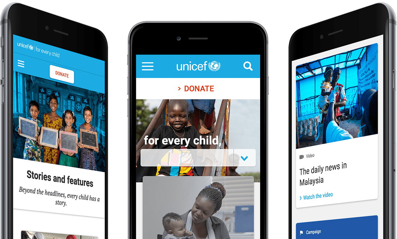
Visitors will be engaged to curate their experience directly from the home page. Featured front and center, “For every child” – UNICEF’s latest campaign tagline – feeds into an unusually prominent drop down menu. This encourages users to discover the organization’s eight main areas of focus and select a path to explore. Simple and effective, this feature brings UNICEF’s mission to light.

The challenge was to design a modular interface that allows content managers around the world to easily create pages, campaigns and microsites while ensuring consistency in brand expression. Thinking in mobile first design and responsive behaviour.
-
About Project
- Using best-practices to create and engage users with a narrative-driven site that showcases the variety of work they do for children.
To take readers to the heart of every story, we reframed articles with first-person introductions.
Click-worthy article titles and engaging previews now make content easier to discover. We also gave prominence to visual storytelling, displaying UNICEF’s signature photography full width and letting content breathe in a sleek, contemporary design.
-
Project Brief
- UNICEF asked us to help redefine their global brand and overhaul their digital ecosystem – to get ready for what’s next. Having gone through numerous phases and additions over the years, their website was outdated and increasingly disjointed. It needed a complete transformation. Providing for children worldwide, UNICEF works in 190 countries and territories and has public-facing National Committees in 34 different countries. To reflect the true ethos of the organization, the new UNICEF.org had to be dependable, seamless, and engaging – and fit for the future.


Atomic design Methodology was used to craft the interface, a beautiful mental way to conceive solid structures in a more cohesive way.
Layouts were builded with Atomic design approach, building elements from the ground-up on a re-usable components.
Atoms were conceived to be combined and build more complex structures: molecules, organism, to finally create full layouts.
Material design principles were used to theming the portal, allowing users to better behave with the interface.


Mobile First
Responsive design was a key for this project. Interactions were designed adopting UI/UX processes, adopting material design as guidance for best practices. Proposed tones meets level AA conformance of W3C Content Accesibility Guidelines


Do you have a creative idea and want to work with me?
Let's talk